Guest Post: FilmDoo’s Poster Picks
SP have come on board to support FilmDoo’s Poster Creativity Competition because, lets face it, it’s all well and good to make a film – but how do you make someone want to come see it? The FilmDoo team have selected a few entries to give you a little inspiration.
Submissions are continuing to flood in for FilmDoo’s Poster Creativity Competition. To celebrate the new partnership with Shooting People, we’ve chosen a few of our favourite entries so far, and compared them against the original artwork…
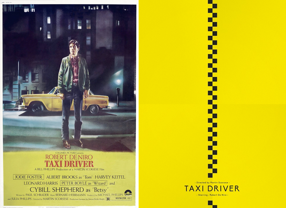 The original theatrical poster that accompanied Taxi Driver and Maxime Damo’s 2015 reboot.
Our first choice, with a decidedly Shooting People colour scheme, comes courtesy of Belgium’s Maxime Damo, whose simple yet stylish approach to Martin Scorcese’s Taxi Driver (1976) created an excitable buzz in the FilmDoo office. Considering the stature Taxi Driver holds in cinematic history, Maxime has chosen an understated approach. The strip down the middle of Maxime’s poster eludes to the pattern that has become emblematic of New York city’s taxis yet it also evokes imagery of a zip; as if behind this poster lies the cinematic tour de force that cinephiles have come to know.
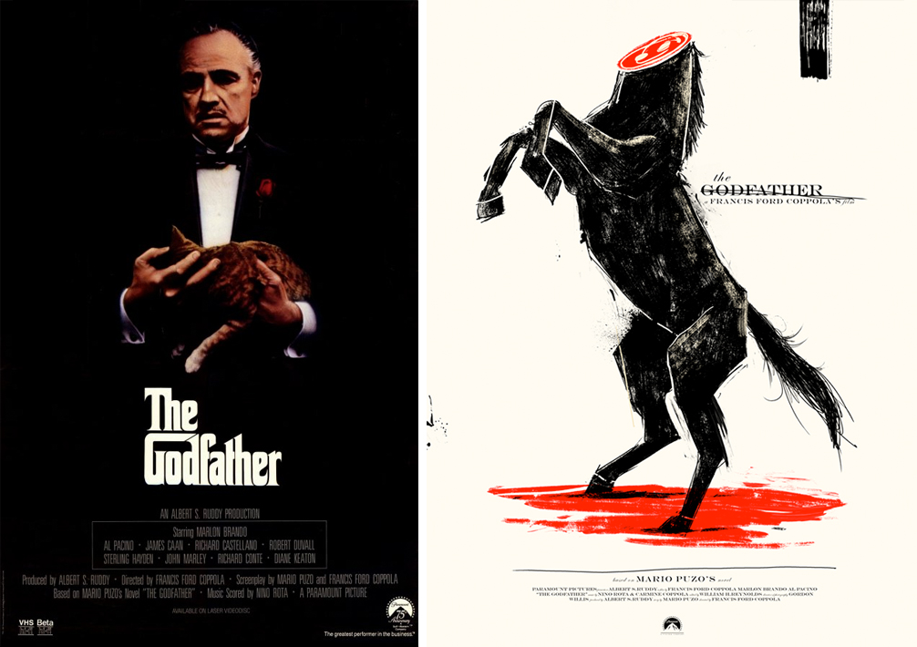
Marie Bergeron’s submission for the FilmDoo poster competition can be seen on the right, whilst the original is positioned to the left – One of our team was reminded of the Ferrari logo meeting a sticky end.
Secondly, the team at FilmDoo went for another of cinema’s greatest films, FrancisFord Coppola’s The Godfather. Just as the aforementioned original poster features its main protagonist as the main focal point, so does the original for The Godfather, as can be seen below.
Visually striking, Canada’s Marie Bergeron’s adaptation of The Godfather’s poster differs greatly from the original. Undoubtedly, Marlon Brando had the power to dominate both the moving image as well as the still, yet Bergeron’s take on the poster takes us right into the heart of the film itself. By referencing a particular scene from The Godfather, Marie contradicts the themes evident in the original. The beheaded stallion comes to symbolise the depraved lengths at which the Corleone family were willing to go to cement their family’s standing and obtain whatever it was they desired.
 A lesbian embrace in the original poster for Blue is the Warmest Colour, left, whilst Sara Suttle’s more organic entry, right, centres on sexual and emotional awakening
Step forth Sara Suttle from the USA, whose almost surrealist take on Blue is the Warmest Colour thoroughly delighted the FilmDoo team. Released in 2013, Abdellatif Kechiche’s female focused erotic drama had the majority of its audiences in raptures at its mature handling of sexual themes, and Suttle’s entry perfectly exemplifies the same sense of intrigue, the hand seemingly reaching out towards sensations both emotionally and sexually-charged, here depicted by flowers.
So far FilmDoo has received over 400 entries for the competition, and there are manymore favourites we’ll be revealing to you in due course. But in the mean time, head on over to the competition page to check out the prizes and jury panel. If you have an eye for movie poster art, or know somebody who does, get involved.
Press Today » Today in Movie Culture: Nicolas Cage Video Game, Morissey as the Hulk and More March 20th, 2015 at 7:00 am
[…] This violently clever poster design for The Godfather comes via artist Marie Bergeron for FilmDoo's Poster Creativity Competition (via Shooting People): […]